Usage metrics: Why every click, tap, and scroll matters.
6 mins read

The hidden signals in usage metrics
Let’s start with a truth. Not all metrics are created equal. Some tell you what’s broken. Some whisper what could be better. And some? They scream when your product is just being used, but not loved.
Usage metrics fall somewhere in the middle. They don’t tell you everything. But they tell you just enough to keep you honest.
Let’s look at five.
1. Average Session Duration
How long do users stay once they arrive?
Imagine you're Netflix. A user opens the app, browses for a bit, watches a documentary for 30 minutes, and logs out. Session duration? Around 35 minutes. That’s a good sign. They didn’t just land and bounce.
But now, imagine you’re a tax filing app. Someone spends 90 minutes filling out forms. That long session might not be a good thing. It could signal friction, confusion, or poor design.
So, duration is relative.
It’s not about being long. It’s about being meaningful.
2. Average Frequency
How often do users return in a given time?
Let’s say you run Spotify. If someone listens to music 3 times a day, that’s gold. But if they return once every 2 weeks, you’ve lost them to YouTube or silence.
Example: Duolingo. The app lives off frequency. It nudges you every day. Sends a guilt trip via their mascot owl. Because they know. Frequency builds habit.
But frequency without value? Is spam.
So always ask: why are they returning?
3. Task Completion Rate
Do users finish what they came to do?
Imagine you're in Google Docs. You start writing a resume. Then the app crashes. Or you can't find the formatting menu. Or you give up halfway.
That’s a failed session.
Now take Swiggy. You open the app. Browse menus. Add biryani. Start checkout. But you drop off at payment.
That hurts. Because every incomplete task is lost revenue.
So task completion rate is your trust barometer. It tells you if people believe your app can get them to the finish line.
4. Time Spent per Feature
Which parts of your product get the most attention?
This is the detective metric.
You’re running Notion. People spend 5 minutes organizing a calendar. But 25 minutes writing in docs.
That tells you what’s sticky. What’s just fluff. And what needs help.
Another one: Instagram. Stories? 15 seconds each. But some users binge reels for hours. That’s why reels get more engineering love.
This metric helps teams stop guessing.
Ship what’s used. Kill what’s ignored.
5. Task Completion Time
How long does it take to finish a key flow?
Think Amazon checkout. If it takes 8 minutes to buy something, users get annoyed.
But if it takes just 2 taps, like “Buy Now,” they love it.
Or Google Maps. How fast do you go from searching a location to getting directions? That speed builds trust.
This metric shows whether your flow is slick. Or sticky in a bad way.
When should you use Usage Metrics?
Now here’s the big question.
When are these metrics useful?
1. During Product-Market Fit exploration
You’re trying to find out if people even care. In early stage. Pre-revenue. Pre-everything.
Usage metrics tell you if there’s any signal. Are they using the core feature? Do they return? Do they spend time in one section? If not, pivot fast.
At this stage, metrics don’t have to be pretty. They just need to move.
2. When optimizing an existing flow
You’ve launched. People are coming. But they’re dropping off. Say you’re building a checkout flow. Task completion rate is low. You look deeper. Time spent per field is high. Especially at payment screen.
Boom. Found the problem.
Usage metrics help you debug. Fix small leaks. Polish the flow. Reduce user friction.
3. When prioritizing product improvements
You’ve got 5 features. But which one do people love? Which one just takes up screen space? Time spent per feature tells you. You’ll learn quickly. Maybe users love search filters but never use sort by rating.
Cut it. Clean it. Focus on what drives usage.
4. When preparing for fundraising or reporting
Investors ask for growth. But they also want stickiness. If you say 100K monthly users, they’ll ask - how long do they stay? What do they do? How often do they come back?
Usage metrics are your receipts. Show, don’t tell.
When should you NOT use Usage Metrics?
Yep. There are moments to ignore them.
1. Vanity tracking
Some metrics look sexy. Like session duration going up. But maybe users are just stuck.
Don’t assume long = good.
Always tie duration to purpose.
Is this time joyful or painful?
2. When testing Brand-New features
You just shipped V1 of a feature. Usage is low. That’s normal. Don’t kill it in a week. Let adoption ramp. Educate users. Run nudges. Then check the metrics.
Patience matters.
3. When the metric has no context
Someone says, “Users spend 10 minutes in our app.” Sounds great. But who are the users? Are they paid or free? Did they come back? Without context, metrics lie.
Always pair numbers with narrative.
4. When qualitative feedback is missing
Usage tells what. It doesn’t tell why. Someone dropped off. Why?
Session was short. Why?
You need interviews. You need surveys. You need the voice of the user.
Usage + voice = truth.
Real life scenarios
Let’s run through five real examples. One for each metric.
Average Session Duration: YouTube Kids
If parents see their kids watching for 30 minutes, that’s good engagement. But if it stretches to 2 hours? That triggers concern.
That’s why YouTube added timers and screen time controls.
Duration is a double-edged sword for them.
Average Frequency: Starbucks App
People who visit the app 5 times a week are power users. They collect points. Redeem offers. Starbucks uses frequency to push loyalty.
Fewer visits? They send offers to nudge you back.
Habit is the new hook.
Task Completion Rate: TurboTax
Tax season. Everyone rushes to file. But if you get stuck at page 6 of 10, that’s a problem. TurboTax tracks how many start and how many finish. Drop-offs trigger email nudges and tooltips.
Conversion is gold.
Time Spent per Feature: Canva
Some users just use templates. Others dive into advanced design tools. Canva watches time spent per module. Then suggests upgrades, new features, or hides unused ones.
That’s smart product growth.
Task Completion Time: Blinkit
Time from app open to order placed is tracked. If it takes too long, Blinkit optimizes filters, menu, and UX.
They know → speed = delight.
Nobody wants to wait to order bananas.
As a PM, what should you do with these metrics?
Here’s a roadmap:
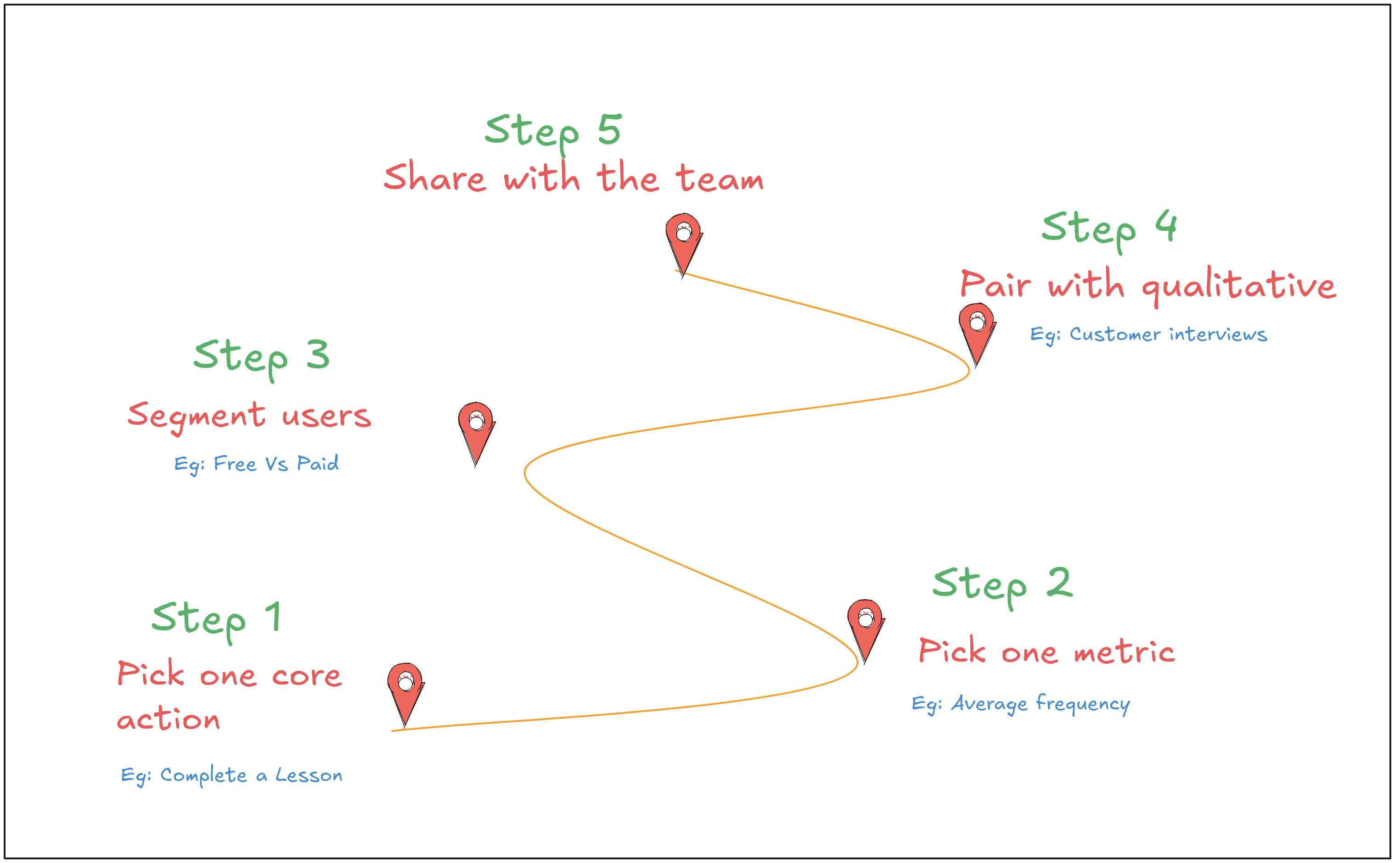
1. Define the “core action”
What is the one thing users must do?
For Google Docs → create a doc.
For Duolingo → complete a lesson.
Track it. Obsess over it.
2. Pick the right usage metric
Each flow has a hero metric.
Sign up? Track task completion.
Daily learning? Track average frequency.
Don’t track for the sake of it.
3. Segment the users
Don’t look at averages. Break it down.
New users vs returning.
Free users vs paid.
Active users vs churned.
That’s where the insights hide.
4. Pair with qualitative
Always run interviews. Talk to users who dropped off. Ask why.
Match numbers with nuance.
That’s product sense.
5. Share with the team
Don’t hoard metrics. Design should know. Growth should know. Engineering should know.
Everyone should feel the pulse of usage.
So, why do usage Metrics Matter?
Because they reveal behavior. Not what users say. But what they do.
That’s gold. That’s where PMs live.
Not in dashboards. But in decisions.
Good metrics don’t just measure. They guide. So use them well.
And never forget - usage is a mirror.
But you still need to ask: What is it showing me?